CRO / Mobile
Mobile Conversion Optimization for Ecommerce
// most of your traffic, half of your conversion

By Fracto Solutions
September 12, 2026
The short answer
Mobile conversion optimization means closing the gap between how much traffic mobile brings (roughly 70 to 78 percent) and how little it converts compared to desktop (often around half). The biggest wins are at mobile checkout, page speed, and tap-friendly design. Because mobile is most of your traffic, fixing it is usually the highest-leverage conversion work a store can do.
70-78%
of ecommerce traffic is on mobile
~½
mobile often converts around half of desktop
Checkout
where mobile loses the most committed buyers
Why does mobile matter so much for conversion?
Because mobile is where most of your traffic is. Across 2026 data, mobile drives roughly 70 to 78 percent of ecommerce traffic, so even a small improvement in mobile conversion affects the largest share of your visitors.
The math makes mobile the priority almost automatically. When three-quarters of your visitors are on phones, the mobile experience isn’t one segment among several, it’s the main experience, and desktop is the exception. Yet many stores still design and test on desktop first, treating mobile as a shrunk-down afterthought. That backwards priority is exactly why mobile underperforms: the experience most shoppers actually have gets the least attention. Fixing that, giving mobile the design and testing focus its traffic share deserves, is where the leverage is.
How big is the mobile-to-desktop conversion gap?
Mobile converts meaningfully lower than desktop, commonly around half to two-thirds of the desktop rate. The exact figures vary a lot by source, but the direction is one of the most consistent findings in ecommerce.
Here’s the honest picture. Different datasets report different exact numbers, one large multi-brand study puts desktop at about 3.9% versus mobile 2.5% (a ~1.56x gap), others report mobile “40 to 50% lower” than desktop, and Shopify-specific data (Littledata) has put mobile near 1.2% against desktop’s 1.9%. A few sources even show mobile catching up or matching desktop. So the precise ratio is genuinely contested. What’s reliable across almost all of them is the pattern: mobile carries most of the traffic and converts lower, and the gap concentrates at checkout.
Metric
Desktop
Mobile
Typical conversion rate
~3.5 to 4%
~1.8 to 2.5%
Share of ecommerce traffic
~22 to 30%
~70 to 78%
Cart/checkout abandonment
~65 to 70%
~78 to 85%
Source: ranges compiled across multiple 2026 datasets (Baymard, Statista, Dynamic Yield, Littledata and others). Exact figures vary by source and method; treat as directional and measure your own by device.
The single clearest takeaway: measure your own conversion rate by device. A blended number hides the gap, and the gap is where the opportunity is. We break the causes down in why is my mobile conversion rate so low.
- The mobile paradox
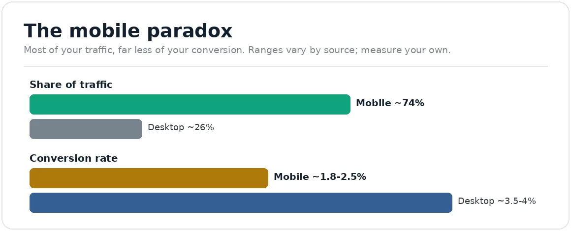
Most of your traffic, far less of your conversion. Measure your own by device.
Why is mobile conversion lower than desktop?
Mostly friction that’s worse on a small screen: harder typing, longer checkout forms split across screens, slower load, and cramped tap targets. The shopper’s intent is the same; the experience fights them more.
The gap isn’t because mobile shoppers are less serious, it’s because mobile makes every step harder. Checkout is the worst offender: a desktop form that fits on one screen gets split across several on mobile, and each extra screen is another chance to give up, which is why mobile cart abandonment runs well above desktop. On top of that, typing on a phone is error-prone (so long forms hurt more), pages often load slower on mobile connections, and small or closely-spaced buttons cause misfires. None of this is mysterious, and all of it is fixable. The fixes cluster into three areas: checkout, speed, and touch-friendly design.
What are the biggest mobile conversion fixes?
Checkout first, then speed, then tap-friendly design. Checkout is where mobile loses the most committed buyers, so it’s the highest-leverage place to start.
Mobile checkout. The number-one fix. Enable express and wallet payments (Shop Pay, Apple Pay, Google Pay) so shoppers skip typing, offer guest checkout, minimize fields, and use autofill. This is covered in depth in mobile checkout best practices.
Page speed. Mobile connections are slower, and shoppers abandon slow pages fast. Meet Google’s Core Web Vitals (LCP under 2.5s, INP under 200ms, CLS under 0.1), and remember these are measured on real users, who are mostly mobile. More in how Shopify speed impacts conversion rate.
Tap-friendly design. Buttons large and spaced enough for thumbs, a visible add-to-cart (a sticky bar helps), legible text without zooming, and a layout that doesn’t break on real devices.
Fix these in order of where your own data shows the steepest mobile drop, but for most stores checkout is the biggest single lever.
Do I need a mobile app, or is mobile web enough?
For most stores, an optimized mobile web experience is enough and where you should focus first. Apps can convert better for high-frequency, loyal-customer businesses, but they’re a major investment, not a fix for a leaky mobile site.
You’ll see data that shopping apps convert higher than mobile web, and that’s often true, but it’s misleading as advice for most stores. An app is expensive to build and maintain, and it only helps customers who already love you enough to install it, it does nothing for the majority arriving via search or ads on mobile web. So the priority order is clear: fix your mobile web experience first, because that’s where nearly all your mobile traffic lands. Consider an app only once your mobile web converts well and you have a large, repeat-buying customer base that would actually use it.
Does mobile speed matter more than on desktop?
Yes. Speed affects mobile conversion more than desktop, because mobile devices and connections are often slower and mobile shoppers abandon slow pages quickly. Since Google measures Core Web Vitals on real users, who are mostly mobile, your speed score is effectively a mobile score.
It’s worth separating the two ideas people blur together. “Responsive design” means your layout adapts to screen size; it says nothing about how fast the page loads or how easily a thumb can use it. A site can be perfectly responsive and still be slow and awkward on a phone. Speed is the part that quietly costs the most, a page that loads acceptably on office wifi can crawl on a mobile connection, and every extra second raises the chance a shopper leaves before they see your product. Because Core Web Vitals (Largest Contentful Paint under 2.5 seconds, Interaction to Next Paint under 200 milliseconds, Cumulative Layout Shift under 0.1) are collected from real-world users, and most of those users are on mobile, hitting those thresholds is really about hitting them on mobile. Test your speed on an actual phone over a normal connection, not a wired desktop, and you’ll see what your shoppers actually experience. The direct link between speed and sales is covered in how Shopify speed impacts conversion rate.
How do I optimize and test mobile specifically?
Measure by device, diagnose where mobile shoppers drop, and test mobile changes separately, on real devices, not just a resized desktop preview. Mobile needs its own optimization loop, not a hand-me-down from desktop.
The method mirrors any conversion work, but device-segmented:
Split every metric by device. Conversion rate, funnel drop-off, and checkout completion should all be viewed mobile-versus-desktop, not blended.
Diagnose the mobile funnel with device-specific session recordings, watching real mobile sessions reveals friction (a button that’s hard to tap, a form that fights back) that dashboards miss.
Test on real devices. A desktop browser shrunk to phone width hides most mobile problems; test on actual phones across iOS and Android.
A/B test mobile changes on their own. A change that wins on desktop can lose on mobile and vice versa, so judge mobile tests by mobile results. The testing method is in how to run A/B tests.
We optimize for the device most of your shoppers actually use, and prove it in device-split numbers.
Rather than treating mobile as a responsive afterthought, we measure conversion by device, diagnose the mobile funnel with real-device session recordings, and fix the biggest mobile leak first, usually checkout. Every change is judged on mobile results specifically, because a blended number hides exactly the gap we’re closing.
It’s the same baseline-first discipline behind our conversion optimization work, where every result is read by device rather than blended, because a blended conversion rate hides the exact gap this page is about. On most stores, mobile is where the gain hides. Fast mobile pages are part of it, which ties to our web development work too.
Frequently asked questions
Why is my mobile conversion rate lower than desktop?
Because mobile makes every step harder: checkout forms split across small screens, error-prone typing, slower load, and cramped tap targets. The shopper’s intent is the same; the experience creates more friction. It concentrates at checkout, where mobile abandonment runs well above desktop.
How much lower is mobile conversion than desktop?
Commonly around half to two-thirds of the desktop rate, though exact figures vary widely by source (some report a ~1.5x gap, others 40 to 50% lower, a few show mobile catching up). The reliable point is that mobile carries most traffic and converts lower, so measure your own by device.
What's the single biggest mobile conversion fix?
Usually mobile checkout: enable express and wallet payments so shoppers skip typing, offer guest checkout, and cut form fields. Checkout is where mobile loses the most committed buyers, so it’s the highest-leverage place to start.
Do I need a mobile app to improve mobile conversion?
No. For most stores an optimized mobile web experience is enough and should come first, that’s where nearly all mobile traffic lands. Apps can convert well for high-frequency, loyal customers but are a major investment, not a fix for a leaky mobile site.
How do I test mobile changes properly?
Split every metric by device, diagnose with real-device session recordings, and A/B test mobile changes on their own, judged by mobile results. Test on actual phones, not a resized desktop browser, which hides most mobile issues.
Keep reading
Sources
Mobile drives roughly 70 to 78% of ecommerce traffic; desktop converts meaningfully higher (commonly ~1.5 to 2x), though exact figures vary by source; mobile cart/checkout abandonment exceeds desktop. The device gap figures quoted in the body (desktop 3.93% vs mobile 2.46%, a 1.56x ratio, on 78.4% mobile traffic share) come from a study of 486 million sessions across 117 European ecommerce brands, the largest device-level dataset we found. The 3.5 to 4% desktop and 1.8 to 2.5% mobile band, and mobile abandonment of 80.02% against desktop 66.41%, come from a separate 2026 compilation. Note the definitional trap: cart abandonment and checkout abandonment are different measures and are often quoted interchangeably, which is why published mobile figures range from roughly 62% to 93%. https://dripagency.de/blog/mobile-vs-desktop-conversion-rates ; https://news.designrush.com/mobile-ecommerce-traffic-desktop-conversion-rate ; https://sqmagazine.co.uk/mobile-vs-desktop-statistics/ Baymard Institute: overall cart abandonment 70.22% across 50 studies; ~$260bn recoverable via better checkout (US+EU). https://baymard.com/lists/cart-abandonment-rate Shopify-specific device gap (mobile ~1.2% vs desktop ~1.9%): Littledata https://www.littledata.io/ecommerce-conversion-rate Google Core Web Vitals thresholds: LCP <2.5s, INP <200ms, CLS <0.1. https://web.dev/articles/vitals