CRO / Mobile
Mobile Checkout Best Practices for Ecommerce
// remove the typing, recover the sale

By Fracto Solutions
September 14, 2026
The short answer
Wallets
40%
Fewer
Why is mobile checkout where the most sales are lost?
Because typing and multi-step forms are hard on a small screen. A desktop checkout that fits on one view gets split across several on mobile, and every extra screen and field is another chance for the shopper to give up. Mobile checkout abandonment runs well above desktop as a result.
The core problem is input. On desktop, filling a checkout form is quick; on a phone, every field means slow, error-prone thumb-typing, and long forms get split across multiple screens that each invite abandonment. Add the general checkout killers, unexpected costs, forced account creation, too many steps, and they all hit harder on mobile. That’s why mobile cart and checkout abandonment consistently exceed desktop across the data. The fixes below all share one goal: get the shopper to a completed purchase with as little typing and as few steps as possible.
What's the single most important mobile checkout fix?
Express and wallet payments. Letting shoppers pay with Apple Pay, Google Pay, or Shop Pay lets them skip manual entry almost entirely, which removes the biggest source of mobile checkout friction in one step.
If you do only one thing for mobile checkout, enable accelerated wallet payments. These let a shopper complete checkout with a fingerprint or face scan instead of typing name, address, and card details on a tiny keyboard, collapsing the hardest part of mobile checkout into a tap or two. Because they attack the root cause (typing on a small screen), they tend to be the highest-impact single change for mobile conversion. Shopify supports Shop Pay, Apple Pay, and Google Pay natively, so this is usually a settings-and-placement task, make the express options prominent, above the standard form, so shoppers see them first. One caveat worth knowing: express wallets pull the shopper’s saved address and card, which is exactly why they convert, but it also means your checkout should handle the returned data cleanly (correct shipping options, no surprise steps after the wallet confirms). Test the full wallet path on a real device end to end, not just that the button appears.
Practice
What it removes
Effort
Express / wallet payments
Manual typing of address and card
Low (settings + placement)
Guest checkout
Forced sign-up friction
Low (setting)
Minimal fields + autofill
Unnecessary input and errors
Low to medium
Costs shown early
Surprise-fee abandonment
Low
Sticky pay button
Hunting for how to complete
Low (theme)
*All five reduce typing and steps, the core of mobile checkout friction.*
What are the other key mobile checkout best practices?
Beyond wallets: guest checkout, minimal fields, autofill and correct keyboards, clear early cost display, and a sticky, obvious pay button. Each removes a specific point of mobile friction.
Offer guest checkout. Forcing account creation is a top abandonment cause everywhere, and worse on mobile where signing up means more typing. Let shoppers buy first, invite the account after.
Cut fields to the minimum. Every field is harder on a phone. Remove anything non-essential (second address lines, company fields you don’t need), and combine where you can.
Use autofill and the right keyboards. Enable address autofill, and trigger the correct keyboard per field (numeric for card and phone, email keyboard for email). Small touches that cut errors and effort.
Show all costs early. Surprise shipping or fees at the final step is the number-one abandonment trigger; reveal the full total before the last screen so there’s no nasty surprise.
Make the pay button obvious and reachable. A clear, thumb-reachable, ideally sticky call to action so shoppers never hunt for how to complete.
- The mobile paradox
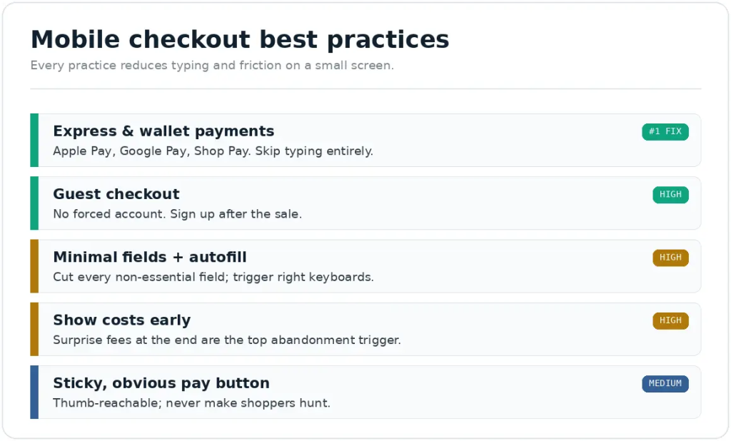
Every practice reduces typing and friction on a small screen.
Should mobile checkout be one page or multiple steps?
Either can work; what matters is minimizing total fields and typing, not the number of screens. On mobile, fewer fields and express payments matter far more than the one-page-versus-multi-step debate.
Stores agonize over one-page versus multi-step checkout, but on mobile it’s largely the wrong question. A multi-step checkout with few fields and wallet payments can convert better than a cramped single page stuffed with inputs. What actually moves mobile conversion is reducing the total effort: fewer fields, express payment options, autofill, and clear progress. Optimize those, and the page-count question mostly takes care of itself. On Shopify specifically, checkout is largely standardized, so focus your energy on what you control, payment options, which fields you require, and how costs are shown, rather than on custom layouts.
How do I know if my mobile checkout is the problem?
Segment checkout completion by device and watch real mobile checkout sessions. If mobile checkout completion is much lower than desktop, or you can see shoppers struggling in recordings, checkout is your mobile leak.
Confirm it with data before you rebuild anything. Compare checkout completion rate (and step-by-step drop-off) on mobile versus desktop, a large mobile gap points straight at mobile checkout. Then watch real mobile checkout sessions with a tool like Microsoft Clarity: you’ll see exactly where shoppers stall, a fiddly field, a missing wallet option, a surprise cost. That evidence tells you which of the practices above to prioritize. After changes, measure mobile checkout completion again to confirm the lift, ideally with an A/B test judged on mobile results.
We rebuild mobile checkout around less typing, then verify it on real devices.
We prioritize express and wallet payments, guest checkout, and minimal fields, then test the full checkout path end to end on real phones so nothing breaks after the wallet confirms.
It’s part of our conversion optimization work, and where the checkout itself needs changes, our web development team handles them cleanly.
Frequently asked questions
What's the best way to improve mobile checkout conversion?
Enable express and wallet payments (Apple Pay, Google Pay, Shop Pay). They let shoppers skip manual typing, which is the biggest source of mobile checkout friction, so they’re usually the single highest-impact change. Then add guest checkout and cut form fields.
Does guest checkout matter more on mobile?
Yes. Forcing account creation is a top abandonment cause everywhere, and worse on mobile because signing up means more typing on a small screen. Offering guest checkout removes that friction; you can invite the shopper to create an account after they’ve bought.
Should I use a one-page checkout for mobile?
It’s not the deciding factor. Minimizing total fields and typing, and offering express payments, matters far more than page count. A multi-step checkout with few fields and wallets can outperform a cramped one-page checkout. Focus on effort, not layout.
Do I need a mobile app to improve mobile conversion?
No. For most stores an optimized mobile web experience is enough and should come first, that’s where nearly all mobile traffic lands. Apps can convert well for high-frequency, loyal customers but are a major investment, not a fix for a leaky mobile site.
How many fields should a mobile checkout have?
As few as possible, every field is harder on a phone. Remove anything non-essential, use autofill, and lean on wallet payments that skip fields entirely. The goal is the shortest honest path from cart to confirmation.
Keep reading
Sources
Express/wallet payments (Apple Pay, Google Pay, Shop Pay) reduce mobile checkout friction by removing manual entry; supported natively on Shopify. Shopify documentation.