CRO / Product pages
Product Page Optimization: The Complete Guide
// the page where browsing becomes buying

By Fracto Solutions
September 14, 2026
The short answer
Product page optimization means improving the page so more visitors decide to buy. The elements that matter most, roughly in order: clear, zoomable images; a visible, obvious add-to-cart; genuine reviews placed near the top; a benefit-led description; and trust signals like ratings, returns, and secure payment. Get the buy box and the trust layer right, and conversion follows.
~270%
purchase-likelihood lift from 5 reviews (Spiegel, Northwestern)
Images
most shoppers inspect these first (Baymard)
4.0-4.7
rating band shoppers trust more than a perfect 5.0
What makes a product page convert?
Two things working together: the “buy box” (images, price, variants, and the add-to-cart) and the “trust layer” (reviews, ratings, returns, security). The mechanics let people buy; the trust layer makes them want to. High-converting pages nail both.
It helps to split a product page into these two jobs. The buy box is the functional core, can the shopper see the product clearly, understand the price and options, and easily add it to the cart? The trust layer is the persuasion, do they believe this is a good purchase from a store they can rely on? Most stores get the mechanics roughly right (research on audited stores finds price and add-to-cart are usually handled) but fall down on the trust layer, missing ratings near the title, poor review placement, no visible returns policy. That trust gap is where most of the opportunity sits, because it’s both high-impact and commonly neglected.
Which product page elements matter most?
In rough priority: images, the add-to-cart, reviews and ratings, the description, and trust signals. Here’s how each performs and the common mistake to avoid.
Element
Why it matters
Common mistake
Product images
Most shoppers inspect images first; visuals drive the decision
Too few images, no zoom, stock photos
Add-to-cart button
The critical action; must be obvious and reachable
Low contrast, hidden below the fold
Reviews & ratings
The strongest trust signal; research shows a large lift
Hidden price, no in-stock signal near the button
Price & availability
Shoppers need both up front
Buried in a tab, not shown near the title
Description
Answers questions and sells benefits
Feature lists or copied manufacturer text
Trust signals
Reduce risk at the decision point
Missing returns policy, no secure-payment cues
*Element roles compiled from Baymard product-page UX research, Spiegel Research Center review data (2017), and Nielsen Norman Group variant guidance. Ordering is our interpretation of that work, not a ranking published by any of them.*
The pattern across the research is consistent: get the visual and trust elements right, near the top of the page, and conversion improves. The rest of this guide takes the highest-impact ones in turn.
How important are product images?
Very, they’re often the single most influential element. Most online shoppers inspect the images before anything else, so image quality effectively is your first impression and a primary driver of the buying decision.
Because shoppers can’t touch the product, images do the job that handling it would in a store. Baymard’s research finds a majority of shoppers inspect product images first, ahead of price or description, which makes image quality foundational rather than decorative. The practical essentials: multiple images from multiple angles, high enough resolution to zoom, images showing the product in use or context (not just on white), and real photography rather than generic stock that shoppers recognize from other stores. Video and customer photos add further reassurance. Poor or sparse imagery is one of the most common and most costly product-page failures, precisely because it undermines the element shoppers rely on most.
Do reviews really make that much difference?
Yes, this is one of the best-evidenced findings in ecommerce. Research from Northwestern’s Spiegel Research Center found that displaying reviews can raise purchase likelihood dramatically, and the effect grows with price.
Reviews are the strongest trust signal you can put on a product page, and unusually, the research behind this is clean rather than aggregator guesswork. The Spiegel Research Center at Northwestern University found that a product with five reviews was around 270 percent more likely to be purchased than one with no reviews, and that displaying reviews lifted purchase likelihood more for higher-priced items (around 380 percent) than cheaper ones (around 190 percent), because reviews reduce more perceived risk when the stakes are higher. Two practical implications: first, place ratings near the product title, not just buried in a reviews tab lower down, so shoppers see social proof at the decision point. Second, don’t chase a perfect 5.0, research consistently finds shoppers trust an average in roughly the 4.0 to 4.7 band more than a suspicious perfect score. Full detail on placement is in product page trust signals that increase sales.
What makes a product description convert?
A description that answers the shopper’s real questions and sells benefits, not just lists features, in a format matched to the product. Match the length to the purchase: short and scannable for simple items, thorough for considered ones.
The description’s job isn’t to describe, it’s to remove doubt and make the value obvious. That means leading with benefits (what the product does for the shopper) rather than a dry spec list, answering the questions that would otherwise cause hesitation (sizing, materials, compatibility, care), and writing for your specific customer rather than copying manufacturer text (which also hurts SEO through duplication). Format matters as much as content: scannable bullets for key benefits up top, with fuller detail below for those who want it. Length should match the purchase, a simple impulse item needs a few sharp bullets, while a considered or expensive product justifies thorough copy. The full approach is in how to write product descriptions that convert.
Where should everything go on the page?
Put the decision-driving elements above the fold, near the buy box: hero image, title, price, rating summary, variants, and add-to-cart. Push fuller detail (long description, specs, full reviews, related products) below. Placement is often as important as the element itself.
Layout is a lever in its own right, the same element can convert well or poorly depending on where it sits. The above-the-fold zone should let a shopper decide without scrolling: a strong hero image (with more images accessible), the title, a clearly visible price and in-stock signal, a star-rating summary near the title, easy variant selection (visible swatches tend to beat dropdowns, which is practitioner consensus rather than a published research finding), and an obvious, high-contrast add-to-cart. Everything else, the full description, specifications, the review detail, a Q&A, and related products, belongs below, in a logical scroll order. A common, costly mistake is burying the elements that drive the decision (especially reviews and the add-to-cart) too far down.
- Product page anatomy
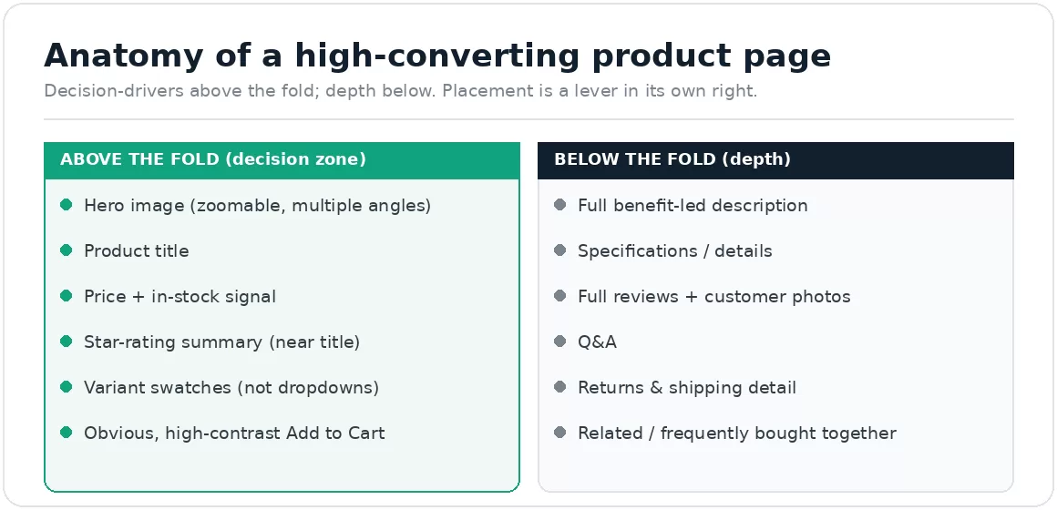
Decision-drivers above the fold; depth below. Placement is a lever in its own right.
Does page speed affect product page conversion?
Yes. A product page full of high-resolution images is heavy, and if it loads slowly, shoppers leave before they see any of your careful optimization. Speed is the foundation the rest of the page sits on.
There’s a tension worth managing here: images are the most influential element on the page, but they’re also the heaviest, so more and better images can slow the page down if you’re not careful. The fix isn’t fewer images, it’s serving them efficiently, modern formats like WebP, correctly sized files rather than huge originals scaled down in the browser, and lazy-loading everything below the fold so the hero loads first. Aim for Google’s Core Web Vitals (Largest Contentful Paint under 2.5 seconds, Interaction to Next Paint under 200 milliseconds, Cumulative Layout Shift under 0.1), measured on real users. A beautifully optimized product page that loads slowly still loses, so treat speed as part of product-page optimization, not a separate concern. The detail is in how Shopify speed impacts conversion rate.
How do I know what to fix on my own product pages?
Diagnose with data before redesigning. Use analytics to see where shoppers drop, session recordings to see why, then test the highest-impact change first, usually images, review placement, or the add-to-cart.
Don’t guess or copy a competitor. Look at your product-page analytics (add-to-cart rate, scroll depth, exits) to find where shoppers stall, and watch session recordings to see the friction directly. That tells you which element is actually costing you, rather than optimizing something that was already fine. Then test the fix: because product pages usually have enough traffic, they’re good candidates for A/B testing. Prioritize by impact, image and review changes tend to move the needle most, and measure the effect rather than assuming. This is the same baseline-first method behind a full CRO audit.
We fix the elements your own shoppers stumble on, in impact order, then prove the lift.
Rather than applying a generic checklist, we diagnose where shoppers hesitate on your specific pages (analytics for where, session recordings for why), then fix the highest-impact elements first, usually imagery, review placement, and the add-to-cart, and test the change on real traffic.
It’s the same baseline-first discipline behind our conversion optimization work, where product page changes are tested one variable at a time so you learn which element earned the result. Where the page itself needs rebuilding, our web development team handles it.
// we would rather show up in your reporting than in your inbox
Frequently asked questions
What is the most important element on a product page?
Usually product images and reviews. Most shoppers inspect images first, so image quality drives the initial decision, and reviews are the strongest trust signal (research from Northwestern’s Spiegel Research Center found a large lift from displaying them). Get both right, and placed near the top.
Do product reviews really increase conversion?
Yes, and it’s well-evidenced. The Spiegel Research Center found a product with five reviews was around 270 percent more likely to be purchased than one with none, with a bigger effect on higher-priced items. Place ratings near the title, and aim for a believable 4.0 to 4.7 average rather than a suspicious perfect 5.0.
How long should a product description be?
Match it to the purchase. Simple, low-cost items convert well with short, scannable bullets; considered or expensive products justify thorough copy that answers every question. In all cases, lead with benefits, not a feature list, and write your own copy rather than copying the manufacturer’s.
Where should the add-to-cart button go?
Above the fold, high-contrast, and obvious, shoppers shouldn’t have to hunt for how to buy. On mobile, a sticky add-to-cart that stays visible as they scroll helps. Hiding the primary action below the fold is a common and costly mistake.
How do I optimize product pages without guessing?
Diagnose first: analytics to see where shoppers drop, session recordings to see why. Then A/B test the highest-impact change (usually images, review placement, or the add-to-cart) and measure the lift, rather than applying a generic checklist or copying a competitor.
Sources
Spiegel Research Center (Northwestern University) with PowerReviews, “How Online Reviews Influence Sales”, published June 2017: purchase likelihood for a product with five reviews is 270% greater than one with none; displaying reviews lifted conversion 190% on a lower-priced product and 380% on a higher-priced one; purchase likelihood peaks in the 4.0 to 4.7 band and declines as ratings approach 5.0. Note the age and the sample: the study drew on purchase data from three online retailers, not a broad market survey, so treat the exact percentages as indicative of direction rather than as current benchmarks. The underlying effects have held up in later work. https://spiegel.medill.northwestern.edu/how-online-reviews-influence-sales/
Baymard Institute: product-page UX findings, and security cues near the checkout action supporting conversion (baymard.com). The “majority inspect images first” point reflects Baymard’s qualitative usability testing rather than a published percentage, so we state it qualitatively.
Variant selection: Nielsen Norman Group’s ecommerce research holds that product variations belong under a single listing, presented as selectable attributes on the product detail page (nngroup.com). The narrower claim that visible swatches outperform dropdowns is practitioner consensus rather than a published NN/G finding, and we present it as such.
Google Core Web Vitals thresholds (LCP <2.5s, INP <200ms, CLS <0.1). https://web.dev/articles/vitals