CRO / Shopify
A Shopify Checkout Optimization Framework
// fix the biggest leak first, then measure

By Fracto Solutions
August 7, 2026
The short answer
To fix abandoned checkouts on Shopify, work through five steps in order: remove surprise costs, cut checkout friction, add trust signals, expand payment options, then measure and iterate. Tackle them in priority order, cost transparency and friction deliver the biggest gains, so they come first.
Checkout abandonment is not one problem, it is a handful of specific, fixable frictions stacked together. This framework gives you a repeatable order to fix them in, so you address the biggest losses first instead of guessing.
It is the hands-on method behind how to reduce cart and checkout abandonment. This is the step-by-step.
Is checkout optimization actually worth the effort?
Yes, and by a wider margin than most funnel work. Baymard has spent a decade testing large-scale checkouts, and the recoverable upside is well documented.
- What better checkout design is worth
35.26%
conversion lift
Average gain available to a large ecommerce site from better checkout design alone.
$260bn
recoverable
Lost orders across US and EU ecommerce recoverable solely through better checkout flow and design.
140
documented causes
Distinct checkout usability issues Baymard has catalogued. This framework targets the largest.
Baymard Institute, from ten years of large-scale checkout usability testing on sites including Walmart, Amazon, Wayfair, Crate & Barrel and ASOS. The 35.26% figure describes large ecommerce sites, so treat it as the ceiling rather than a forecast for a small store.
Why do you need a framework, not just tips?
Because random fixes waste effort. A framework sequences the work so you fix the highest-impact friction first and can measure whether each change helped.
Most checkout advice is a scattered list of tips, but not all fixes matter equally. Baymard asked shoppers why they abandoned, and the answers are lopsided: one cause is twice the size of the next. A framework puts that cause first and builds in measurement so you know what worked.
- The five-step framework
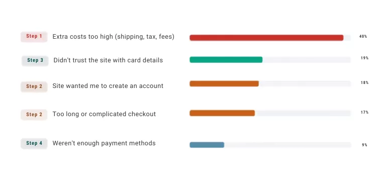
The percentage against each step is the share of abandoners citing the cause that step addresses, from Baymard’s research. Steps 1 and 2 together target more than half of all stated reasons, which is why they come first.
Which step fixes which problem?
Each documented abandonment reason maps to exactly one step. Seeing them side by side is what makes the order obvious.
- Abandonment reasons, mapped to the step that fixes them
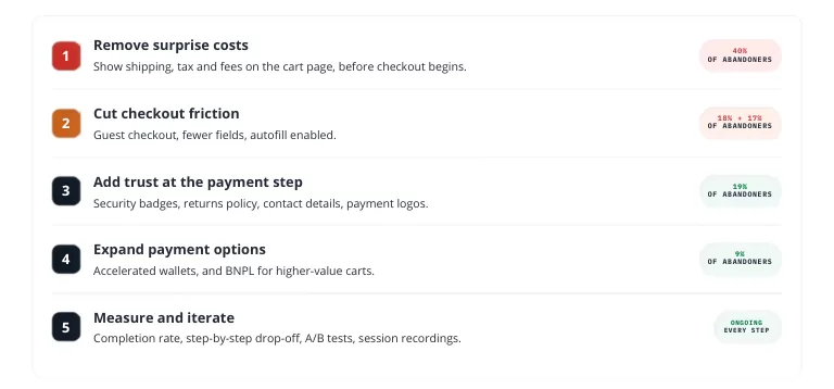
Baymard Institute, reasons for abandoning at checkout, US shoppers. Multi-select, so these do not sum to 100%. The “just browsing, not ready to buy” response (42%) is excluded because it is not a design problem, and no step here can fix it.
Step 1: Remove surprise costs
Show the full cost, including shipping and fees, as early as possible. At 40% of abandoners, unexpected costs are the single biggest documented reason, so this is always step one.
Display estimated shipping and the full total on the cart page, before checkout begins. A free-shipping threshold cue (“you’re $12 away from free shipping”) reframes shipping as a goal rather than a shock, and often lifts average order value. If margins allow, baking shipping into the price removes the trigger entirely.
Step 2: Cut checkout friction
Strip checkout to the essentials. Two causes dominate here: forced account creation at 18% and an overly long checkout at 17%, so together this step targets more than a third of abandoners.
Offer guest checkout, and invite account creation after the order rather than before it. Then attack length. Baymard’s benchmark of large ecommerce checkouts found the average flow shows far more form elements than it needs.
- Form elements in a checkout flow

Baymard Institute checkout benchmark database. For most checkouts a 20% to 60% reduction in form elements is achievable, and this is just one of the 140 documented causes of checkout usability problems.
Remove non-essential fields, enable address autofill, and collapse the flow into as few steps as possible. Every field you delete is one fewer chance to give up.
Step 3: Add trust at the payment step
Reassure shoppers precisely where they hesitate. 19% of abandoners say they did not trust the site with their card details, making this the third-largest single cause.
At payment, shoppers weigh whether to trust you with their card. Show security badges, a visible return policy, clear contact information, and recognizable payment logos. Reviews or guarantees near checkout help too. This changes how safe the shopper feels at the decision point, often the difference between a completed and abandoned order.
Step 4: Expand payment options
Offer the methods your shoppers actually want, including one-tap wallets. 9% of abandoners leave simply because their preferred method was missing.
Beyond cards, that means accelerated wallets, Shop Pay, Apple Pay, Google Pay, which also speed up mobile checkout dramatically by removing manual entry. Buy-now-pay-later can help for higher-value carts. The goal: no shopper abandons simply because they could not pay the way they wanted.
Step 5: Measure and iterate
Confirm each change actually helped, then repeat. Optimization without measurement is just guessing more expensively.
After each change, watch checkout completion, step-by-step abandonment, and overall conversion. Where you have traffic, A/B test so you know the lift is real, not seasonal. Session recordings show exactly where shoppers still hesitate, pointing to the next fix. It is a loop, not a one-time project. The diagnostic guide covers reading the data.
How do I prioritize if I can't do everything?
Do steps 1 and 2 first. Between them they address 75 percentage points of stated abandonment reasons, more than steps 3 and 4 combined.
Cost transparency and guest checkout alone recover a meaningful share of lost orders, because they target the largest documented triggers. Trust and payment options are important but second-order. And always keep step 5 running, without measurement you cannot tell progress from motion.
We run this framework on your store, then prove the lift.
We work the five steps against your actual checkout, starting with the friction costing you the most, and measure each change so you can see the recovered orders in your own numbers rather than taking it on faith.
On one engagement, rebuilding the buying path lifted conversion 6% and revenue per visitor 7%, both A/B tested at 95% confidence.
Frequently asked questions
What's the fastest checkout fix I can make?
Usually enabling guest checkout and showing shipping costs on the cart page. Together they target 40% and 18% of stated abandonment reasons, and both can often be changed quickly in Shopify settings or your theme.
How much can checkout optimization improve conversion?
Baymard puts the available gain at 35.26% for a large ecommerce site with a well-tested checkout, and estimates $260 billion in lost US and EU orders as recoverable through better checkout design alone. Treat those as the ceiling rather than a forecast, but the direction is well established: checkout is where committed buyers abandon, so fixing it targets the most recoverable losses in the funnel.
How many fields should a Shopify checkout have?
Baymard’s testing puts an ideal flow at 12 to 14 form elements, or 7 to 8 if you count only the input fields. The average US checkout shows 23.48, so for most stores a 20% to 60% reduction is achievable without losing anything the order actually needs.
One-page or multi-step checkout?
Either can work; what matters is minimizing total friction and fields rather than the number of screens. Test with your own traffic, and focus on what you control: costs, trust, payment options, and speed.
How do I know my checkout changes worked?
Measure completion and step-by-step abandonment before and after, and A/B test where you have traffic. Session recordings show where shoppers still struggle, which points you at the next fix.
Sources
Checkout abandonment reasons, US shoppers, multi-select so figures do not sum to 100%: extra costs 40%, card-security distrust 19%, forced account creation 18%, too long or complicated checkout 17%, too few payment methods 9%. “Just browsing / not ready to buy” (42%) excluded as it is not a design problem — Baymard Institute.
Checkout benchmark and testing, same source: average US checkout flow 23.48 form elements (14.88 counting fields only); ideal flow 12 to 14 (7 to 8 fields only); 20% to 60% reduction achievable for most checkouts; 140 documented causes of checkout usability issues; 35.26% average conversion gain available to large ecommerce sites through better checkout design; $260 billion of US and EU orders recoverable.
Fracto client engagement: +6% conversion rate, +7% revenue per visitor, A/B tested at 95% confidence.