CONVERSION / Shopify
Why Your Shopify Store Gets Traffic but No Sales
// find the leak,fix it, prove it

By Fracto Solutions
July 25, 2026
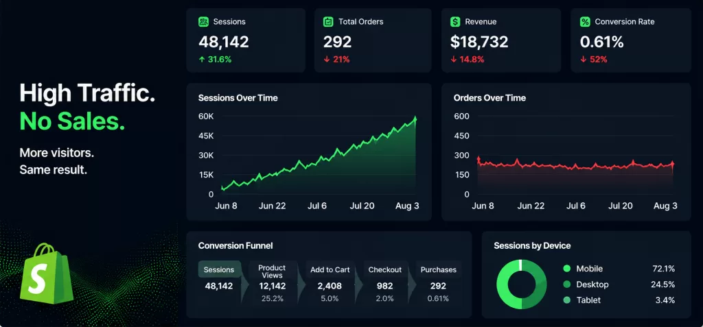
The short answer
If your Shopify store gets traffic but no sales, it’s almost always one of five things: broken tracking, low-intent traffic, ads that don’t match your landing pages, cost or trust friction at checkout, or an offer that doesn’t justify its price. Find which leak is yours before you change anything.
Most store owners respond to this by buying more traffic. It rarely works. You’re already paying for visitors, so the question worth asking is how many of them convert, and where the rest disappear. Below are the five reasons, in the order you should actually check them.
First, is your store actually broken, or is your rate just normal?
Before you diagnose anything, rule out two things: that sales are silently failing, and that your conversion rate is simply average.
Store owners tend to describe this in stark terms. “900 visitors but 0 sales, what am I doing wrong?” Or: “traffic is 100 plus a day and sales suddenly stopped.” Those are two different problems. Zero sales at real volume usually means something is broken, typically tracking or checkout. A drop from a working baseline means something changed, maybe your traffic mix, a site update, or just the season.
Then benchmark honestly, because this is where a lot of panic comes from. The average Shopify store converts about 1.4% of its visitors, according to Littledata’s 2023 benchmark of 2,800 stores. Anything above 3.2% puts you in the top 20%, and above 4.7% in the top 10%. So if you’re sitting at 1% to 2%, you might not be broken at all. You might be average, staring at an opportunity and calling it a problem. Near zero at real traffic is different. Keep reading.
Two caveats before you use that number as a verdict. Littledata’s figure is a blended average across categories, and “good” swings hard by what you sell: high-consideration and luxury items sit lower, consumables and impulse buys sit higher. Device mix and traffic source move it too. The honest comparison is against your own category and your own baseline last quarter, not against a single industry number.
- Where your rate sits against the benchmark
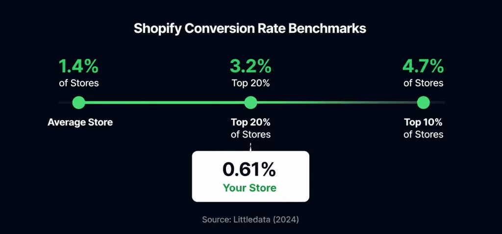
Most stores that describe themselves as broken land somewhere in the first band. That’s worth knowing before you spend a month rebuilding something: average is not the same as failing, and the gap between 1.4% and 3.2% is a business case rather than an emergency.
01. Your sales are happening but not being recorded
The fastest thing to rule out is broken tracking or a silent checkout failure, because it costs nothing to check and it makes a healthy store look dead.
Place a real test order yourself, start to finish. Does payment go through? Does the order show up in Shopify? Then check whether your analytics and pixels actually fire on the thank-you page.
Plenty of things can hide real sales here: a GA4 setup that was never finished, a conversion tag pointing at the wrong event, a payment gateway that quietly fails on certain cards or on mobile. The whole check takes ten minutes, and it can save you a week of redesigning something that was never the problem. If you can’t trust your numbers, everything you do next is guesswork with extra steps.
02. You have traffic, but not the right traffic
Getting visitors isn’t the same as getting buyers, so the next step is to check traffic quality by source.
Cold traffic from broad social campaigns, giveaways, or junk referral sources will happily browse and leave. It was never going to buy. Open your analytics and segment sessions by where they came from.
Search intent is the clearest version of this. Someone typing “best running shoes” is still deciding. Someone typing “buy Nike Pegasus 41 men’s size 10” has already decided and is looking for a checkout. If your SEO and your ad keywords sit almost entirely in the first group, you’ll collect sessions and very few orders, and the store isn’t what’s broken.
A few things to look for. If a big share of your “traffic” is referral spam or paid clicks from a loose audience, your store isn’t the issue. If visitors land and bounce inside a few seconds, that usually means the page didn’t deliver what the ad promised. And be careful comparing channels: paid social often converts at a fraction of what email or organic search does, so a flood of cheap social clicks can look like growth while doing nothing for revenue.
There’s a second cost to bad traffic that owners tend to miss. It doesn’t just fail to convert, it contaminates the numbers you’d use to diagnose everything else. Thousands of unqualified sessions push your conversion rate down and your bounce rate up, and every genuine problem underneath gets harder to see.
- Segmenting sessions by source
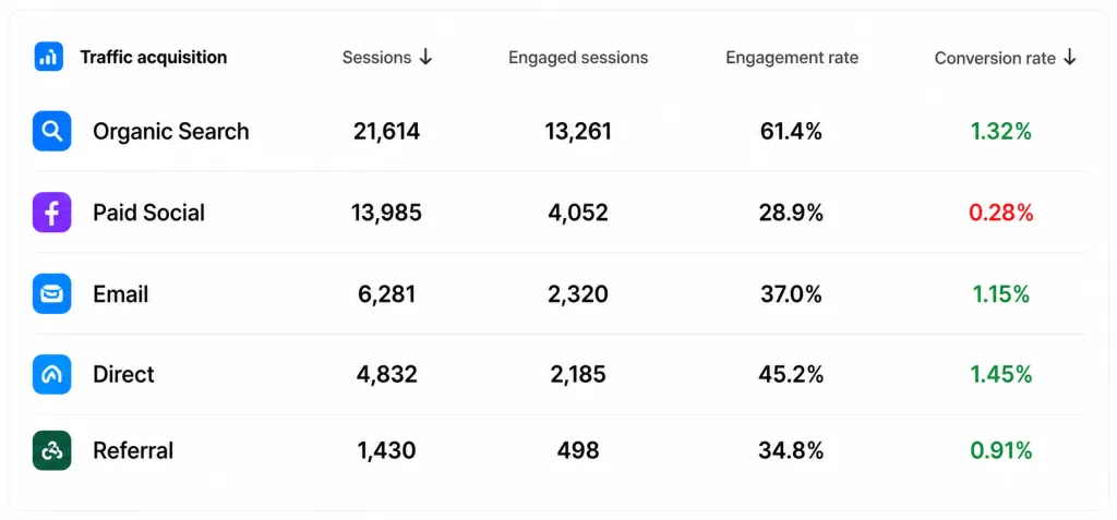
The column that matters is conversions per channel, not sessions per channel. A source can be your largest traffic contributor and your smallest revenue contributor at the same time, and until you split the table this way, the two look identical from the dashboard.
03. Your ad promises one thing and your page delivers another
If your ad sets an expectation your landing page doesn’t immediately continue, people leave. So audit the click-to-page journey.
Picture the sequence. Someone sees an ad for a specific product at a specific price, clicks, and lands on your homepage. Now they have to go find the thing they already decided they wanted. Most won’t bother.
The landing page should pick up exactly where the ad left off: same product, same offer, same promise, visible without scrolling. Marketers call this message match, and it’s one of the most common leaks in ecommerce, partly because it falls between two teams. Whoever runs your ads isn’t usually the person who owns the landing page, so nobody quite owns the handoff.
The most damaging version is a price or discount that changes between the ad and the page. An ad implies one number, the page reveals the offer only applies to a bundle or a minimum order, and the visitor doesn’t feel misled so much as done with you. Trust is spent before they’ve scrolled.
Check the same thing on the way down, too. Every promise made on the product page, free shipping, a free gift, a bundle price, has to survive all the way into the checkout. When the banner and the actual shipping rule disagree, nobody notices until a customer reaches payment and finds the offer missing.
The five-second homepage test
If your ads point at the homepage, run this before anything else. Show it to someone who has never seen your store, for five seconds, then close the tab and ask them two questions: what do we sell, and what would you do next? If either answer is a guess, the page is too noisy to convert paid traffic, and no amount of budget fixes that.
04. Buyers don't trust you yet, or the cost surprises them
New stores lose shoppers in the cart and checkout process because of missing trust signals
The numbers here are brutal. Average cart abandonment sits at 70.22%, based on Baymard Institute’s analysis of 50 studies. Seven in ten people who add something to a cart walk away. Set aside the shoppers who were only browsing, and one reason dominates: 39% abandon because of unexpected extra costs at checkout, things like shipping costs, taxes, and fees showing up at the last second. Another 19% leave when you force them to create an account first. Checkout length piles on top of that. The average US checkout puts 23.48 form fields in front of a buyer, when 12 to 14 is closer to ideal. It’s worth being precise about what actually causes the abandonment, because it isn’t the amount. A $39 product that becomes $54 at the final screen doesn’t lose the sale because $54 was unaffordable. It loses the sale because the number moved after the shopper had already committed. The surprise is the problem, not the price. Delivery timing works exactly the same way. “Ships in 5 to 7 business days” is a vaguer promise than “order today, arrives Thursday,” and a shopper buying for a birthday or a trip will leave rather than gamble on the vague one. Now picture a first-time visitor. No reviews to reassure them, a return policy they can’t find, no way to reach a human, and a shipping charge that appears on the final screen. Hesitation becomes a closed tab. You don’t build trust with design polish here. You build trust with specific answers: who are you, what happens if this doesn’t fit, and when does it arrive. The fixes aren’t mysterious:- Show the total cost, shipping included, as early as possible. A geolocated estimate or even a range on the product page beats an exact number revealed too late.
- Show a specific delivery date, not a shipping window.
- Offer guest checkout.
- Cut form fields to what you genuinely need, and make the cart editable so a wrong size doesn't mean starting over.
- Turn on express and familiar payment options: Shop Pay, PayPal, Apple Pay, Google Pay.
- Put reviews, returns, and security signals where people see them before they reach for a credit card, not in the footer.
- Where the checkout loses people
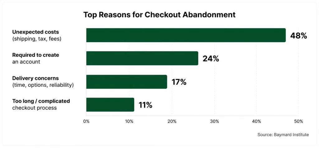
Every bar to the left of “just browsing” is something you control. That’s the useful way to read this chart: it isn’t a list of reasons shoppers are difficult, it’s a list of decisions the store made on their behalf.
The leak nobody checks: speed and the mobile experience
Most Shopify traffic is mobile, and a store that’s fine on your laptop can be quietly unusable on a phone.
This one hides from owners better than any other item on the list, for a simple reason: you test your store on a fast connection, on a big screen, on a device that has already cached half your assets. Your visitors don’t.
The usual causes are dull and fixable. Uncompressed hero images. App bloat, where every app you’ve ever installed still loads its scripts on every page, including the ones you stopped using. Layout that shifts while the page settles, so people tap the wrong thing. On a phone, a few seconds of that is enough to lose a visitor who was never especially committed.
Then there’s the layout itself. A theme that looks composed on a wide monitor can stack in the wrong order on a phone: images crop badly, the value proposition falls below the fold, and Add to Cart ends up beneath a wall of description text.
Run the real test rather than a preview. Open your store on your own phone, on mobile data, and time how long it takes to work out what you sell, find a product, and add it to the cart. Then hand the phone to someone who has never seen the store and ask them to buy something without any help from you. What they hesitate over is your fix list.
- The same product page, two devices
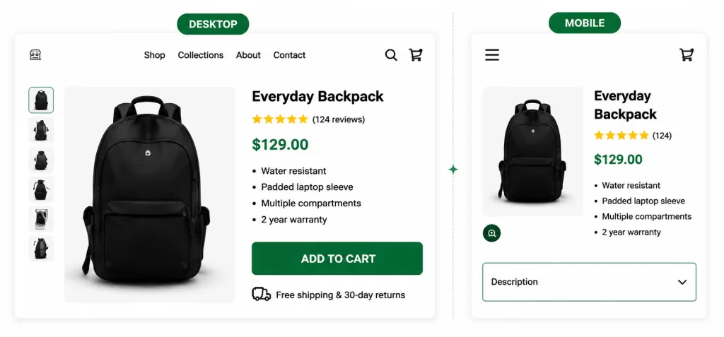
Nothing is broken in the mobile view. The sections simply stack in the order the desktop layout implied, which puts the one action that matters underneath everything else. This is the most common mobile problem we find, and it’s a theme setting rather than a rebuild.
Where store owners lose the sale
- 2026 benchmarks
Metric
Figure
Source
Average Shopify conversion rate
1.4%
Littledata, 2,800 stores (2023)
Conversion rate to reach the top 20% of stores
3.2%
Littledata benchmark
Conversion rate to reach the top 10% of stores
4.7%
Littledata benchmark
Average cart abandonment rate
70.22%
Baymard Institute, 50 studies
Abandon due to unexpected extra costs (top reason)
39%
Baymard Institute
Abandon due to forced account creation
19%
Baymard Institute
Avg. checkout form elements (vs 12 to 14 ideal)
23.48
Baymard checkout database
Fracto client result: product-page rebuild (one Shopify portfolio)
+6% CVR, +7% rev/visitor
Fracto engagement, 95% confidence A/B test
Sources: Baymard Institute, Cart Abandonment Rate Statistics (updated Sept 2025); Littledata Shopify benchmark (2023). Final row: one Fracto client engagement, A/B tested at 95% confidence.
- The conversion rate breakdown, in Shopify Analytics
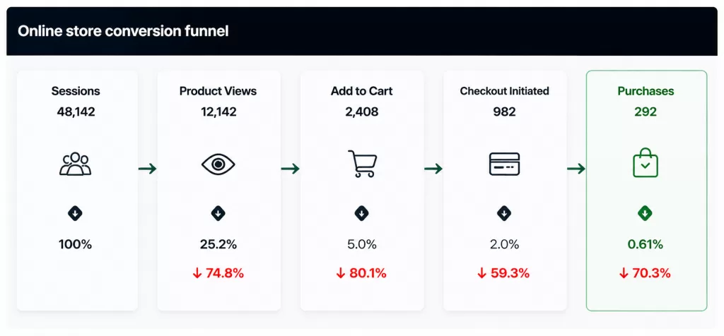
This is the view to open first: Shopify Admin, then Analytics, then Conversion rate breakdown. Read it left to right. Sessions but almost no add-to-carts points upstream, at the product page or the traffic itself. Add-to-carts that never reach checkout point at the cart. Reaching checkout without completing points at cost, trust, or friction inside the checkout.
Before the cart: the product page has to do the selling
If shoppers browse but rarely add to cart, the leak is on the product page, and it’s usually copy, proof, or images rather than layout.
Three failures account for most of it. Descriptions lifted from a supplier, which read as a spec list and never say who the product is for or what problem it solves. No reviews, or worse, reviews that look manufactured: uniformly five stars, no photos, no dates, near-identical phrasing. And a single flat product photo with no scale, no context, and no zoom, which asks people to spend money on something they can’t inspect.
The copy fix is a rewrite in one direction: from feature to outcome. “Stainless steel, 750ml, BPA-free” tells a shopper what it is. “Keeps drinks cold for 24 hours, won’t sweat in your bag or leak in your car” tells them what changes if they buy it. Same product, different decision.
Then read your own page as though you know nothing about the product and write down every question you still have at the bottom: sizing, materials, delivery, what happens if it doesn’t fit. That list is your fix list, and answering it on the page is usually worth more than any redesign.
Small interface details matter here too. If tapping a size or color produces no visible change, shoppers can’t tell whether the selection registered, and uncertainty at the moment of decision reads as risk.
- Feature-led copy versus outcome-led copy
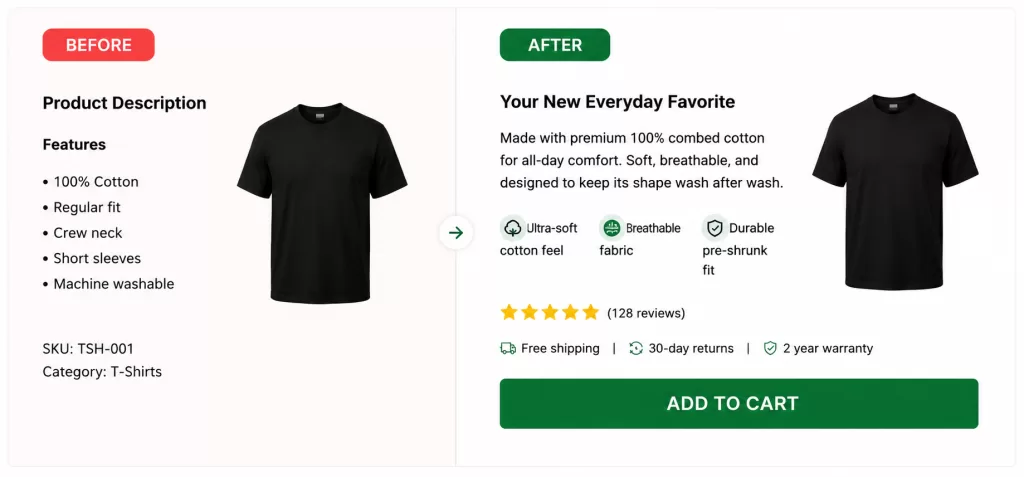
Nothing on the right is untrue about the product on the left. It’s the same item, described in terms of what it does for the person reading. This is normally the cheapest test available on a product page and one of the more reliable ones.
Your calls to action are competing with each other
If the traffic is right and the page loads fast, the next thing to check is whether the page tells people what to do next, once, clearly.
Most Shopify themes ship with more calls to action than a page needs. A homepage carries a hero button, a newsletter popup, a chat widget, a promo bar, and a collection grid, each asking for a different action. A product page adds a wishlist link, a size guide, a subscribe option, and a related-products carousel beside the one button that matters. Every one of these is defensible on its own. Together they split attention at the exact moment you want it concentrated.
Three checks are worth running. First, on each page, identify the single action you want most and confirm it is visually dominant, not merely present. Second, read the button copy on its own: “Submit,” “Continue,” and “Learn more” tell a shopper nothing about what happens next, while “Add to cart” and “See sizes and delivery” do. Third, open the page on mobile devices and count how many taps stand between landing and the cart, because a call to action sitting below three screens of description is functionally missing.
Sticky elements help here, but only when they replace clutter rather than add to it. A persistent Add to Cart bar on a long mobile product page is usually a gain. That bar plus a chat bubble plus a cookie banner plus a discount strip is three quarters of a small screen spent on things the shopper never asked for.
The popup deserves its own note. An email capture that fires before a visitor has seen a product interrupts the journey rather than extending it, and on mobile devices it often covers the entire screen. Delay it until the visitor shows intent, or trigger it on exit rather than on arrival.
05. The offer itself isn't compelling at the price
Sometimes the honest answer is that your offer doesn’t justify its price to the audience you’re sending, and no amount of optimization fixes that.
Say tracking is clean, traffic is decent, message match is tight, and checkout is smooth. Sales still don’t come. At that point you’re probably looking at pricing or product-market fit. Maybe the value proposition is thin next to a competitor. Maybe the price feels high for what people think they’re getting. Maybe the audience simply doesn’t want it.
A better button color won’t rescue any of that. This is the rarest of the five in practice, but it’s the one worth being most honest about, because it changes the entire job. You’ve stopped doing conversion work and started doing positioning work.
- What session recordings surface
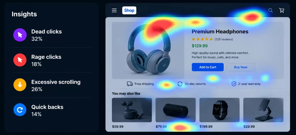
Microsoft Clarity is free, and this panel is where we start. Dead clicks mean people tapped something that did nothing at all, usually a variant swatch or an image that looks clickable. Quick backs mean visitors landed and bounced straight back out, which is normally a sign the page did not deliver what the ad or listing promised.
How to diagnose which reason is yours, in order
Work through the checks in sequence, cheapest and most common first, so you find the real leak fast.
01. Verify checkout and tracking with a test order (Reason 1).
02. Segment traffic by source to judge quality (Reason 2).
03. Open the store on your own phone on mobile data and try to buy something. Time it.
04. Watch 20 to 30 session recordings of people who left. Microsoft Clarity is free, and an hour of this usually tells you whether you have a message-match problem (Reason 3) or a checkout problem (Reason 4).
05. Read your checkout funnel. Shopify’s own analytics will show you where drop-off clusters. If people reach checkout and stall, it’s friction or cost. If they never reach checkout at all, the problem is further upstream on your product or cart pages.
06. Only then ask whether the offer itself is the issue (Reason 5).
That order matters more than it looks. Most owners skip straight to a redesign or a bigger ad budget, both of which are expensive ways to aim at the wrong leak. The earlier a drop-off happens, the more shoppers it costs you, and every fix downstream works better once the one above it is solved. A faster checkout can’t rescue a visitor who already gave up on the product page.
How much website traffic do you need before the numbers mean anything?
Most conversion advice assumes you have enough website traffic for the numbers to mean something. Plenty of stores do not, and diagnosing a conversion problem on thin data is how owners end up chasing leaks that were never there.
The math is unforgiving. At a 1.4% average conversion rate, a store doing 50 sessions a day expects fewer than one order per day. A week with zero sales at that volume sits well within normal variation, not evidence that anything is broken. A/B testing needs hundreds of conversions per variant before the result means anything, which at that traffic level is months of waiting rather than a two-week experiment.
This is why the diagnosis order in this article matters more for smaller stores than larger ones. Test orders, traffic segmentation, and session recordings work at any volume because they show you what is happening rather than what the averages say. Conversion rate comparisons and split tests do not.
It also changes what counts as high traffic. A thousand sessions a month from social media, spread across a dozen posts and a handful of paid campaigns, gives you almost no usable segment data. Five hundred sessions a month from search, concentrated on three or four product pages, gives you something you can actually read.
If you are working with a few hundred sessions a month, spend your effort on the qualitative checks above and on removing obvious friction, then revisit the numbers once your website traffic supports them.
Reading four numbers together
You don’t need a dashboard for this. Four metrics, read in pairs, will point at a stage rather than a symptom.
- Diagnostic pairs
What you see
What it usually means
Where to look first
High bounce, low add-to-cart
Traffic or first impression
Ad-to-page match, page load speed, mobile layout
Good sessions, low add-to-cart
Product page
Copy, reviews, images, variant selection
High add-to-cart, high checkout drop-off
Checkout
Extra costs, guest checkout, form length
Everything healthy, still no orders
Offer or tracking
Test order first, then pricing and positioning
Framework based on the funnel stages measured in Shopify Analytics and GA4. Thresholds vary by store; read the pairs against your own baseline rather than an industry average.
Whichever pair matches your store, resist the urge to change five things at once. If you fix the checkout, the product page, and the ad targeting in the same week and the number moves, you’ve learned nothing about which one earned it, and you’ll carry all three changes forward whether or not they helped.
Each leak maps to a service we own in-house.
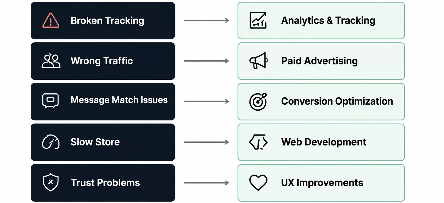
We find the leak, fix it, and prove the gain in your own numbers.
Frequently asked questions
Why is my conversion rate so low on Shopify?
Usually one of five reasons: broken tracking hiding sales, low-intent traffic, an ad-to-page mismatch, cost or trust friction at checkout, or a weak offer. Benchmark before you panic. The Shopify average is around 1.4%, so 1% to 2% may be perfectly normal. Near zero at real volume usually means something concrete is broken.
How do I know if my tracking is broken?
Place a real test order end to end and confirm it appears in Shopify and fires your analytics and pixels on the thank-you page. If the order goes through but never shows up in your reports, you have a measurement problem, not a conversion problem.
Should I fix my store or spend more on ads first?
What is a good conversion rate for a Shopify store?
The average is about 1.4% (Littledata). Above 3.2% puts you in the top 20%, above 4.7% in the top 10%. That said, “good” swings hard by industry, device mix, and traffic source, so compare yourself against your own category rather than a blended average.
Does site speed really affect Shopify sales?
Yes, and mostly on mobile. Slow pages raise bounce rates, which means fewer people ever reach the product page, so the damage shows up as weak add-to-cart numbers rather than as a speed complaint. The usual causes on Shopify are uncompressed images and app bloat, where apps you no longer use still load scripts on every page. Test on a phone using mobile data, not a desktop preview.
Should I focus on more traffic or better conversion?
Conversion, in most cases. Doubling your conversion rate has the same revenue effect as doubling traffic, without doubling ad spend, and it compounds across every channel you already run. The exception is genuinely thin traffic: if you’re working with a few dozen sessions a day, you don’t yet have enough data to diagnose a conversion problem reliably.
How much of my lost revenue is recoverable?
A meaningful share. Baymard estimates roughly $260 billion in lost orders across the US and EU could be recovered through better checkout flow and design alone, and most of that comes down to removing cost surprises and unnecessary friction.
Keep reading
Sources
Littledata, Shopify conversion rate benchmark (2023 study of 2,800 Shopify stores): 1.4% average; top 20% above 3.2%; top 10% above 4.7% — littledata.io
Baymard Institute, Cart Abandonment Rate Statistics (updated Sept 2025): 70.22% average across 50 studies; excluding “just browsing”, extra costs 39%, forced account creation 19%; average checkout has 23.48 form elements; ~$260 billion recoverable — baymard.com