Conversion / Shopify
How to Optimize Shopify Product Pages for More Sales
// the moment of decision

By Fracto Solutions
September 3, 2026
The short answer
To optimize a Shopify product page, focus on five things in order: a clear, visible add-to-cart; strong images that show scale and detail; complete product information; visible social proof; and a clean mobile layout. The product page is where buying intent is won or lost, so small improvements compound.
The product page is the moment of decision. A shopper has found something they might want; everything on this page either moves them toward buying or gives them a reason to hesitate. This is the product-page deep-dive under the broader Shopify CRO guide.
- Anatomy of a product page
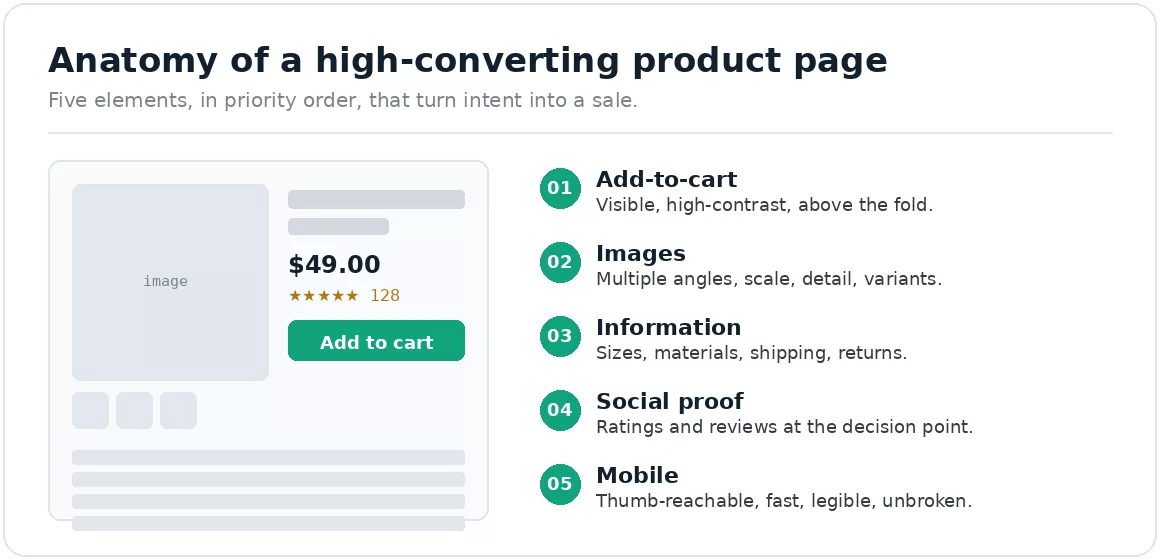
The five elements that turn intent into a sale, in priority order. Fix the ones closest to the buying action first.
What makes a product page convert?
Clarity and confidence. The page must answer, quickly and completely, “is this right for me, and can I trust buying it?”
A converting product page removes doubt: the shopper sees exactly what they’re getting, understands the details that matter, trusts that others bought successfully, and can act without friction. When any of those is missing, hesitation creeps in, and hesitation is where sales are lost.
Start with the add-to-cart
Make the primary action impossible to miss, visible without scrolling, high-contrast, unambiguous, especially on mobile.
Keep it above the fold, give it a standout color, and use a clear label. On mobile, consider a sticky add-to-cart bar that stays visible as shoppers scroll. If a shopper decides to buy and then has to hunt for the button, you’ve added friction at the worst possible moment.
Get the images right
Images do the selling online. Show scale, detail, context, and variants, not just one small photo.
Show the product from multiple angles, include a scale shot, zoom-level detail for texture and quality, and images of each variant. Lifestyle shots help shoppers picture owning it. It’s not volume for its own sake, it’s removing every visual uncertainty that would cause hesitation.
Write information that removes doubt
Answer every question before it’s asked. Missing information, sizes, materials, shipping, returns, is a silent conversion killer.
Each unanswered question is a reason to leave and “think about it”, which usually means not buying. Cover sizing (with a guide where relevant), materials and specs, shipping times and costs, and returns, clearly and near the decision point. Structured, scannable info beats a wall of text.
Add social proof at the decision point
Reviews, ratings, and customer photos reduce perceived risk exactly where the shopper is deciding.
Social proof transfers trust from other buyers to the hesitant shopper. Star ratings near the title, written reviews further down, and real customer photos all signal that others bought and were happy. Placement matters, keep the reassurance visible at the moment of decision.
Don't neglect mobile
Most shoppers are on mobile, where a cramped or slow product page does the most damage. Design mobile-first.
Check that images load fast and swipe cleanly, the add-to-cart is thumb-reachable, text is legible without zooming, and the layout doesn’t break. Test on a real device, not a shrunk desktop preview, which hides most mobile problems. Mobile carries most traffic and already converts lower, so this is your largest audience.
What should I optimize first?
Start with the add-to-cart and mobile layout, then images, then information and social proof.
Make the add-to-cart unmissable and the page clean on mobile first, those touch the buying action most directly. Then strengthen images and fill information gaps. Let your data guide you, session recordings show exactly where shoppers hesitate. The Shopify CRO guide covers how this fits the wider funnel.
We optimize product pages against your own shopper behaviour.
Our conversion optimization team watches how real shoppers use your product pages, where they hesitate, what they ignore, then fix the elements costing you the most, in impact order, and measure the lift.
On one engagement, rebuilding the buying path lifted conversion 6% and revenue per visitor 7%, A/B tested at 95% confidence.
Frequently asked questions
How many product images should I use?
Enough to remove visual doubt, typically several: multiple angles, a scale shot, detail close-ups, and each variant. Coverage matters more than a specific number.
Where should reviews go?
A star rating near the product title, with fuller reviews and customer photos lower down. The summary signal should be high on the page for reassurance at the point of decision.
Does product page speed affect conversion?
Yes. Slow product pages lose shoppers before they engage, and speed is a ranking factor. Compress images and limit heavy apps.
Should the product page differ on mobile?
It should be designed mobile-first, since that’s most of your traffic. Same content, laid out for a thumb: reachable add-to-cart, fast swipeable images, legible text.
Keep reading
Sources
Device conversion gap: mobile 1.2% average vs desktop 1.9% average, and mobile carries over half of Shopify traffic — Littledata Shopify benchmark, 2,800 sites, 2023 data.
Fracto client engagement: +6% conversion rate, +7% revenue per visitor, A/B tested at 95% confidence. Client remains anonymous.