We built a flat HTML prototype first, before touching WordPress.
That decision paid for itself. Three rounds in, after the client had sat with a clickable version, the direction changed to a multi-page site instead of the one-pager, with several sections reorganized. That’s a structural rewrite. In flat HTML it cost days. On a live WordPress build it would have cost weeks we didn’t have.
Accessibility got the same treatment. ADA compliance came up in the first round of structural notes, not as a late request, so we scanned early and worked the list down on a schedule instead of finding a backlog the week of launch.
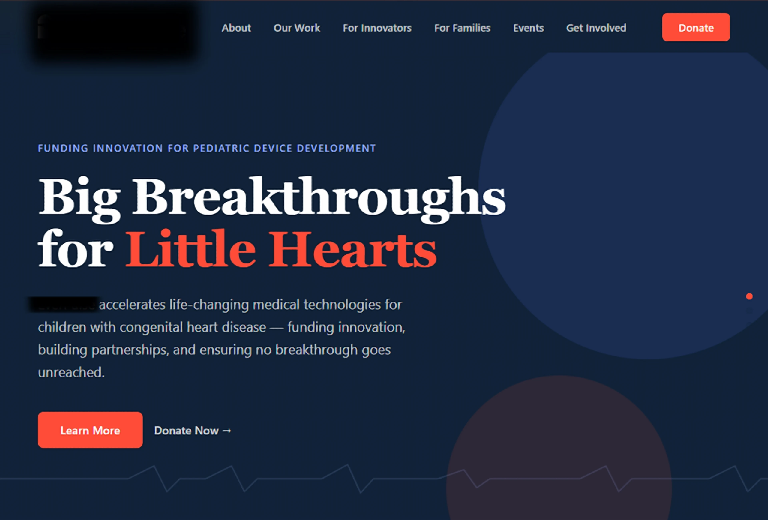
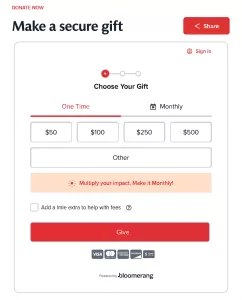
Prototyped in HTML, then rebuilt in WordPress. Eight pages, licensed brand typefaces, anchor navigation, embedded donation form. Client review reshaped it into ten pages: Home, About, Funding, Get Involved, Our Impact, Events, Donate, Contact, plus privacy and terms.
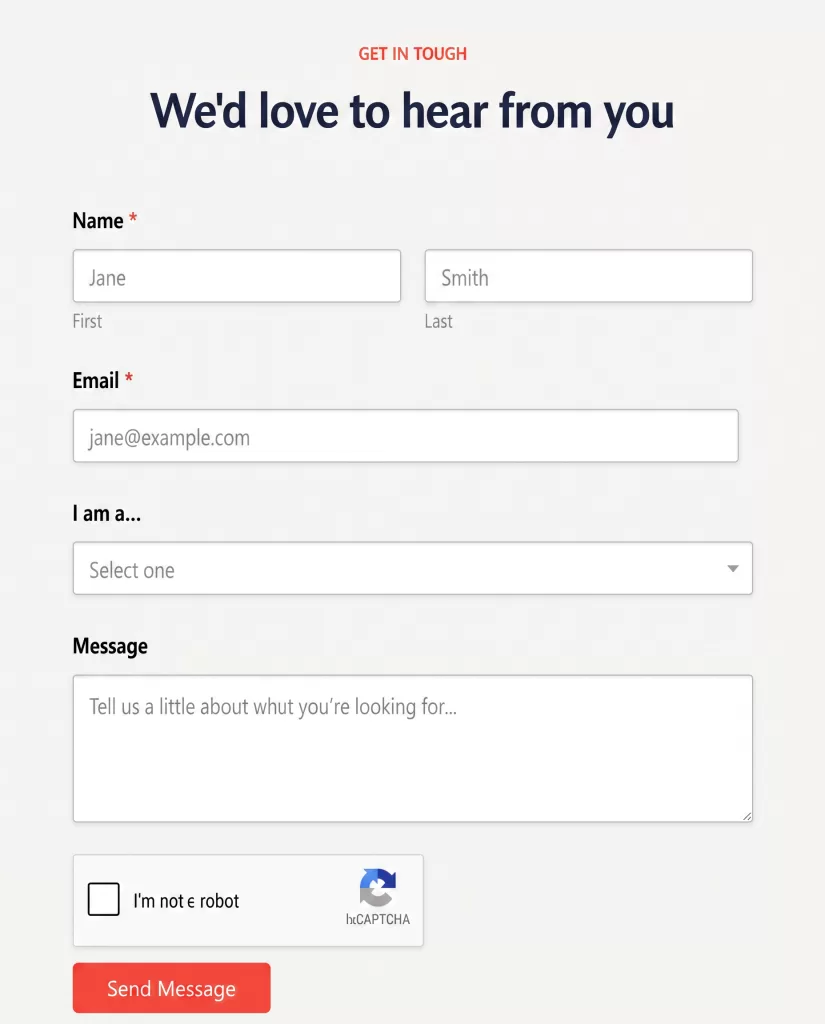
Fixed the friction the client had complained about. Every contact button on the prototype was a dead end at first review. We built a contact form and pointed all of them at it. The Donate button in the nav scrolled to the section above the donation form rather than the form itself — a small miss that costs real donations. We anchored it straight to the embed. Then we went through every button label on the site and rewrote anything that didn’t say where it was about to take you.
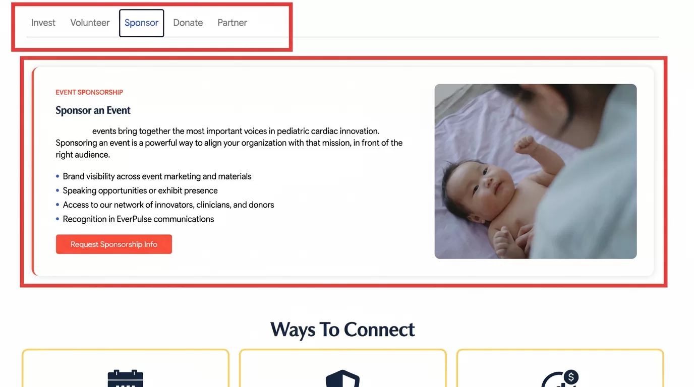
Tuned the motion down, twice. The first pass had bounce, zoom, and scale. The feedback was that it read campy. We stripped it to fade and slide-up. The next review flagged the horizontal slides as still too much on desktop — except in one section, where the boxes were large enough that the movement worked. We removed the rest and kept that one.
Ran accessibility as a tracked workstream. Scanned against WCAG 2.2 Level A/AA, then worked the count down across four sessions. Alt text, heading hierarchy, form labels, landmark roles, duplicate titles, link text, contrast.
Migrated off WordPress.com onto self-hosted WordPress. Built on a staging subdomain so the live site never went dark. Pointed the domain over, issued SSL, configured DNS and MX so the organization’s Microsoft 365 email kept flowing through the cutover.
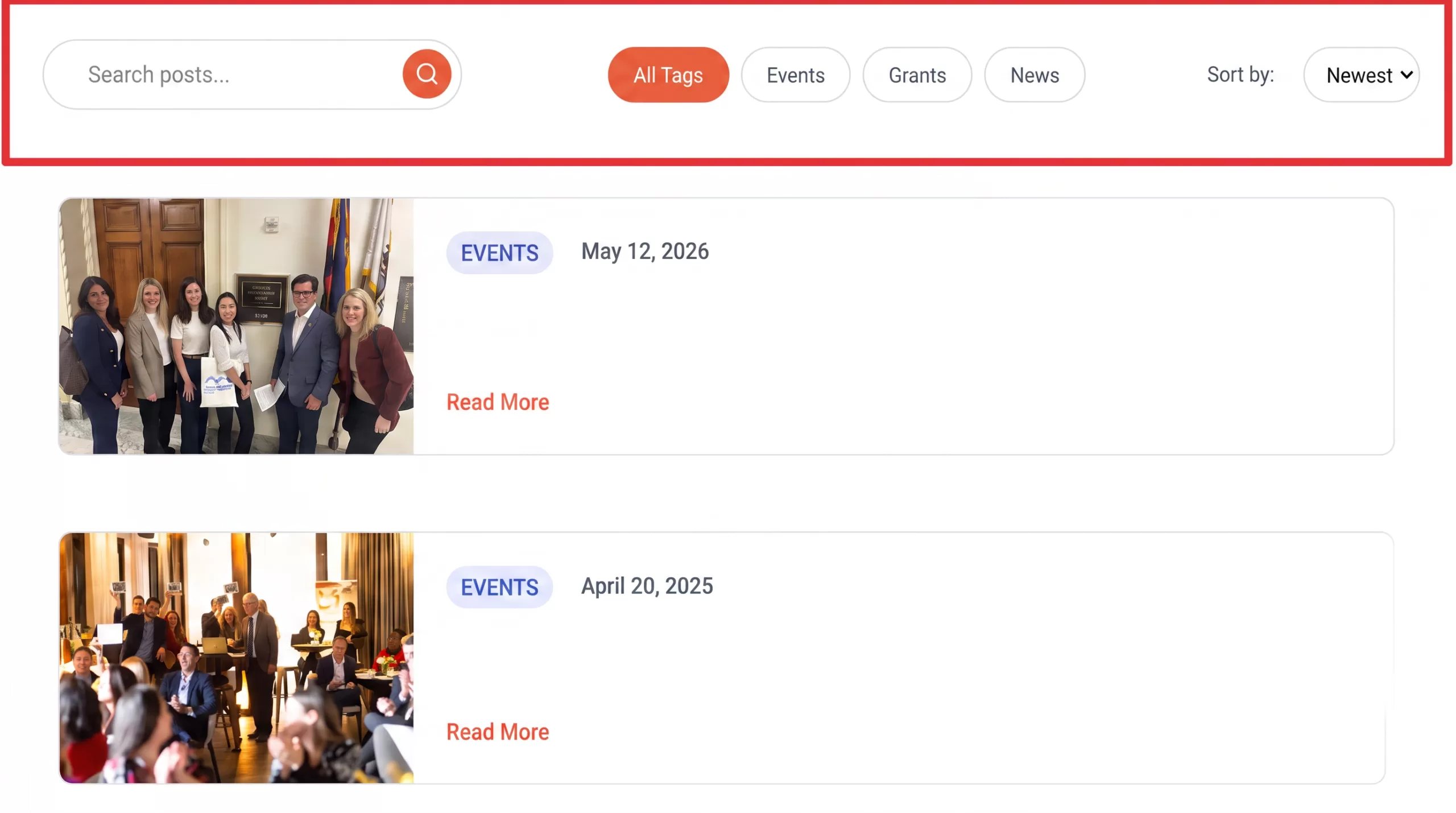
Built the archive the site would need at scale. After launch, the Our Impact page became a searchable post archive: keyword search, filtering across four tags, date sorting, scroll position held on reload. The client expects hundreds of entries eventually, and had asked us to keep the site free of paid plugin dependencies, so we built it custom on free ACF, then put the tradeoffs on the table — what a paid plugin would buy, what custom code would cost, where each one breaks on future updates — and let the client decide with real information rather than a recommendation dressed up as a fact.
Optimized after launch, not instead of it. Stripped unused plugins, compressed assets, cleaned up what the builder left behind.
Handed over something she could run. Visual editor, dashboard walkthrough, reusable post template, admin access, full backup.
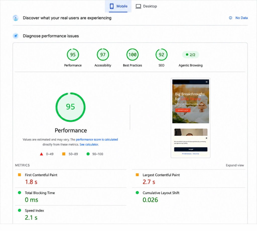
Mobile is the number that counts here. A parent looking up a pediatric cardiac program is doing it on a phone, frequently on a hospital connection, frequently at 2am. A site that stalls at that moment doesn’t get a second visit.
PageSpeed – Mobile
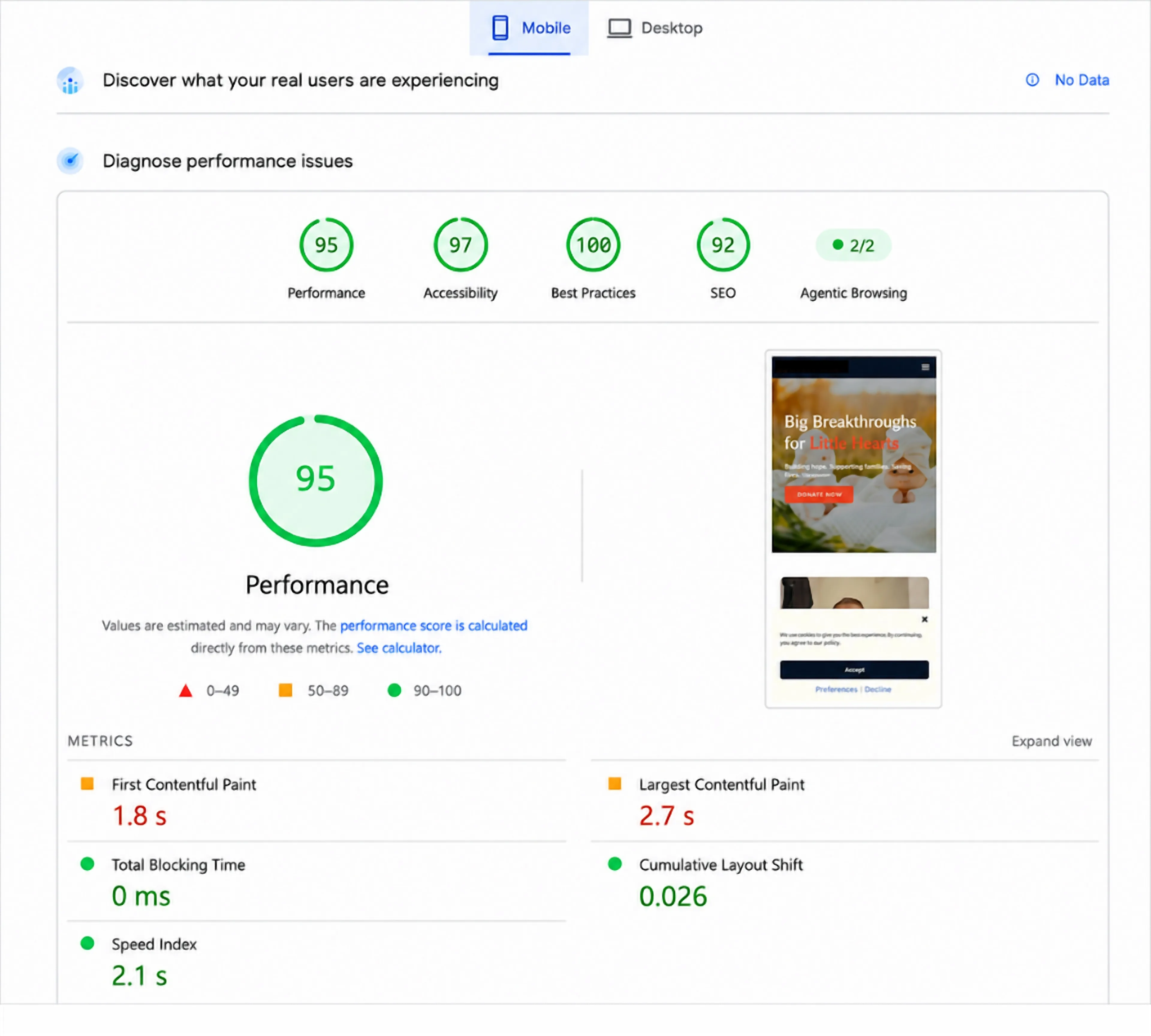
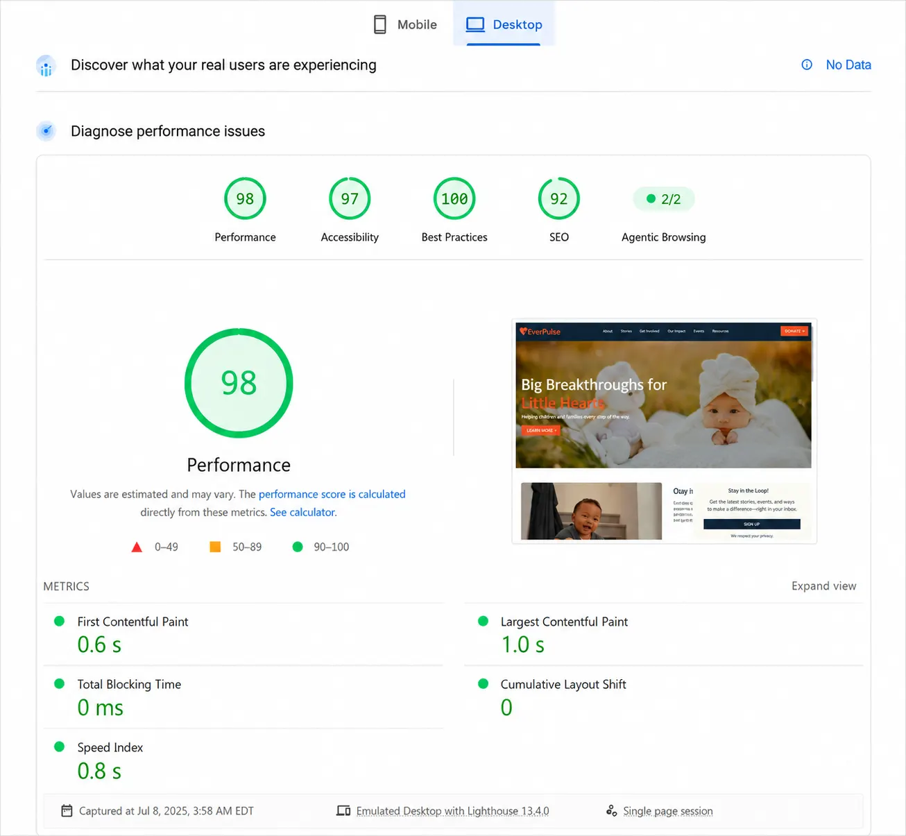
PageSpeed – Desktop