Traffic was not the problem. Conversion was.
The primary storefront takes hundreds of thousands of sessions a month and converts under one percent of them. What the client needed was not a one-off audit. It was ongoing conversion work across four separate storefronts, applied consistently, with nothing going live until it was proven.
Four constraints shaped how that had to work. Each storefront carried its own theme, catalog, and buyer base. Promotions and UX patterns had drifted apart from one store to the next. There was no safe way to trial a change without exposing all four stores to it. And the client needed to stay the decision-maker on everything that shipped.

Scope and scale
This build produced no clean performance metric, so scope is the proof.
Test on one. Roll out to four.
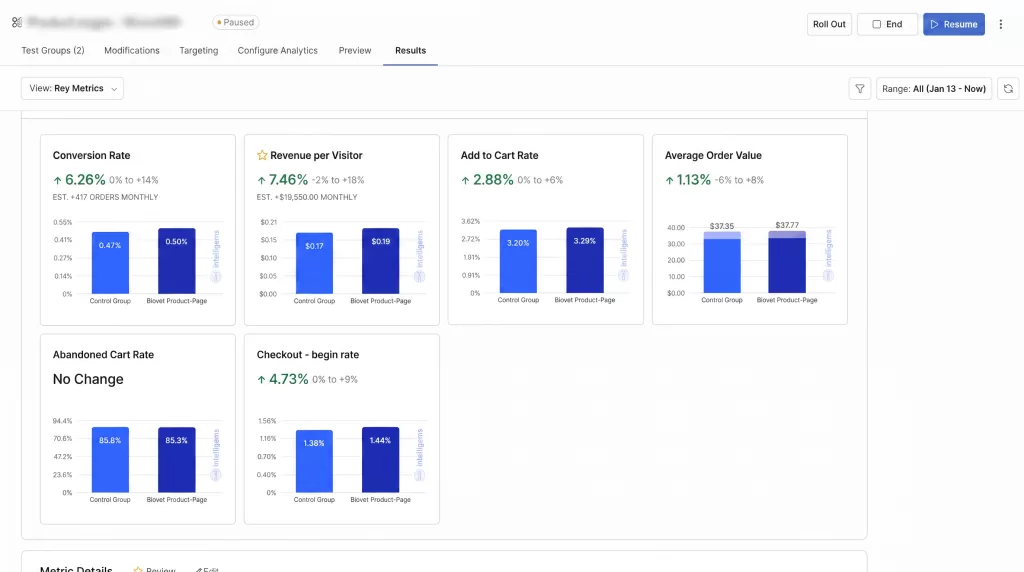
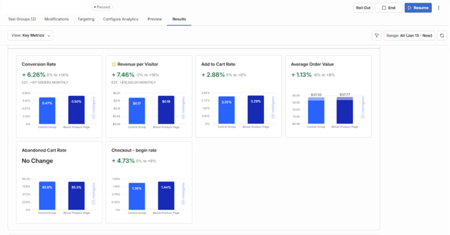
One storefront became the testing ground. The other three became the rollout. Every A/B test ran on the test store alone, was reviewed on conversion rate, revenue per visitor, and average order value, then went to the client for sign-off. Nothing shipped without approval, and approved changes were replicated across the remaining storefronts.
That single rule is what capped the risk. Three stores were never exposed to an unproven change.
Running underneath it: weekly audits on the two priority stores, session recordings and behavior tracking showing where real visitors hesitate or drop off, and a promo calendar planned once and implemented across all four.
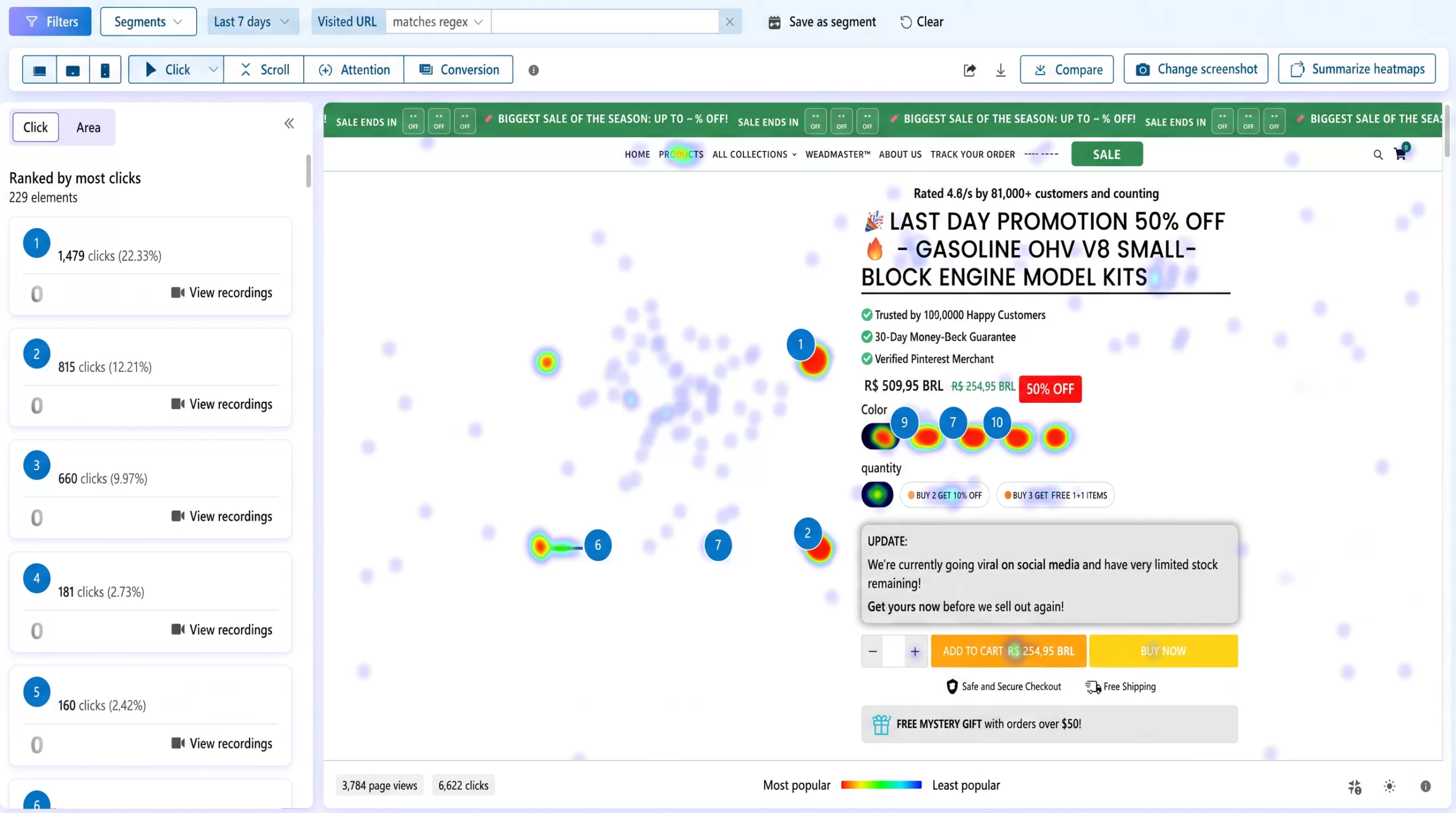
Rebuilt what a buyer sees before scrolling. Studied how the strongest competitors in the category structure their product pages, then rebuilt the entire above-the-fold block: trust signals lifted above the price, color options condensed from two long rows into compact chips, urgency and social proof pulled up, and one high-contrast CTA in place of a button buried below the fold.
Gave ready buyers a direct route to checkout. Visitors who have already decided were being slowed by a cart step they did not need. Added a Buy Now CTA alongside Add to Cart, jumping straight to checkout without disturbing normal cart behavior.
Read the cost of that win, not just the win. The shortcut removed the cart’s chance to sell a second item. Rather than report the flattering half, we measured both sides and designed the next experiment around the gap.
Rebuilt order value at the moment of checkout intent. The checkout click is the last moment a visitor is still open to adding an item. Surfaced an unclaimed free gift, the exact amount still needed to unlock it, and a short window, while keeping checkout one click away.
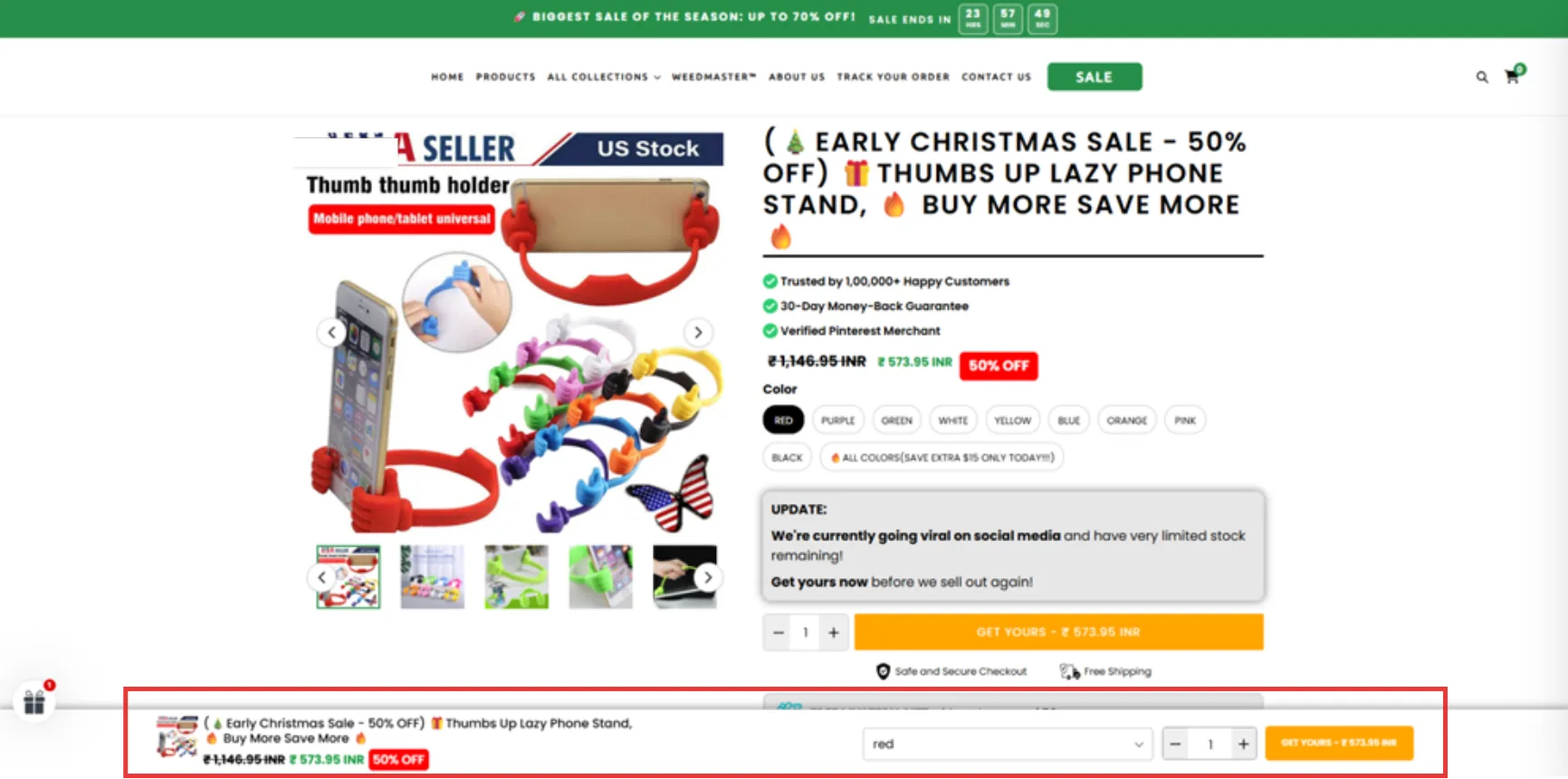
Turned proven principles into permanent defaults. On long product pages the CTA scrolled out of view, so a visitor who decided halfway down had to scroll back up to act. Shipped a persistent bar carrying thumbnail, price, savings badge, variant, quantity, and the primary CTA. Not a fourth test, a default, built on a principle two experiments had already proven.
Made the threshold mechanic permanent on a second storefront. Free shipping and gift thresholds existed but were invisible until checkout. Added a two-stage progress bar at the top of the cart drawer showing the exact amount remaining, with markers for both milestones.
Shipped one campaign across the whole portfolio. A seasonal sitewide sale planned once and implemented on every storefront on schedule, with matching offer logic, urgency mechanics, and creative. Same offer, same live countdown, across storefronts in two languages.
Kept the backlog grounded in recorded behavior. Weekly audits and session analysis feed the test queue, so the next experiment is chosen from evidence rather than opinion.
We studied how the strongest competitors structure their product pages, then rebuilt the entire above-the-fold block — trust signals lifted above the price, color options condensed into compact chips, urgency and social proof pulled up, one high-contrast CTA replacing a button buried below the fold.
Before
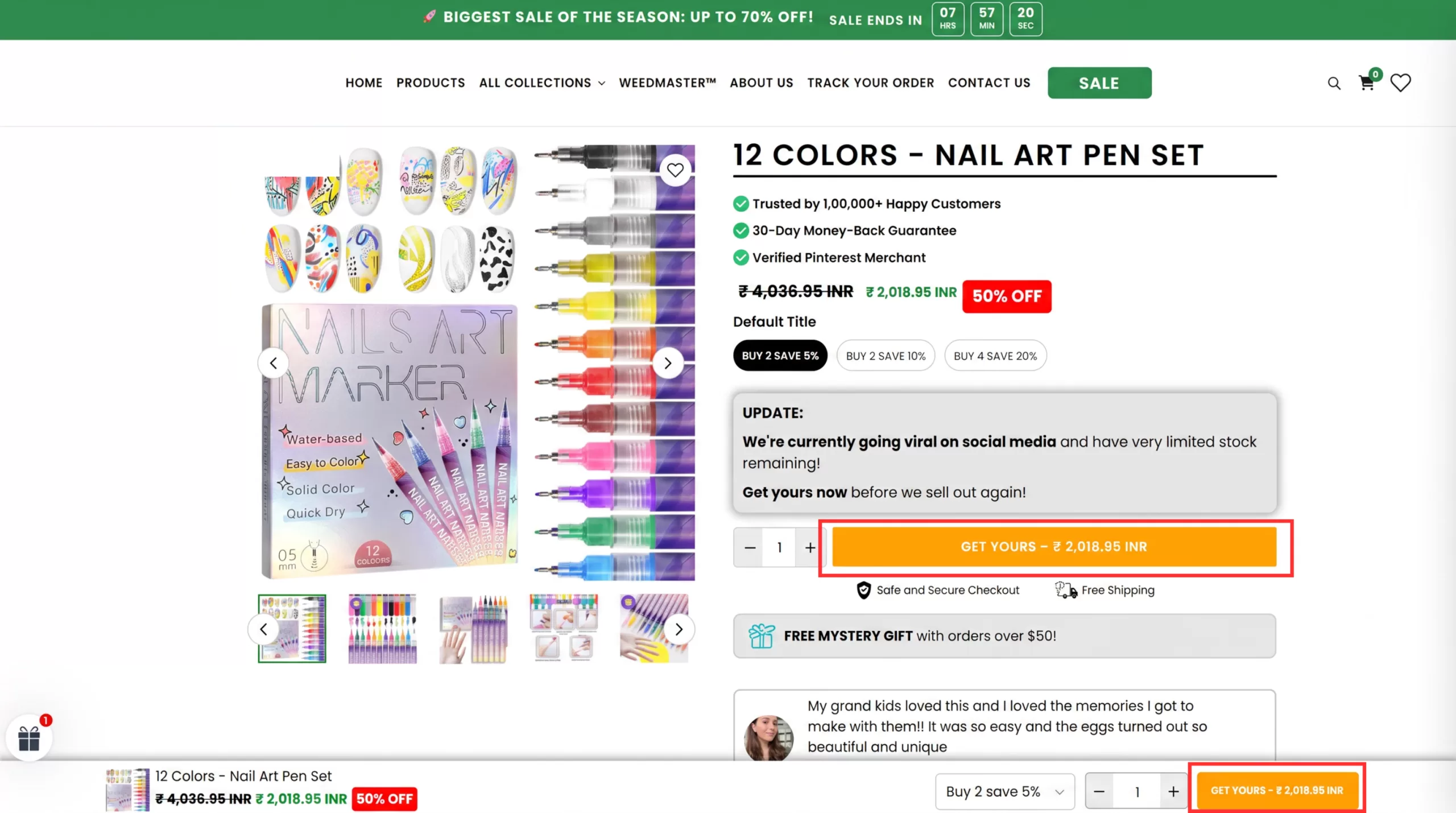
After
And the 6% of order value it cost. Average order value fell from $40.35 to $37.96 as single-item buyers skipped the cart upsell. Net revenue still rose $2,992 across the test, because the extra orders more than covered the smaller baskets. Both numbers came out of the same test. Speed at the top of the funnel and basket size at the bottom are two readings of one change, not a good test and a bad one.